A Month or Two with Arch Linux
Ever since Windows released the Windows Subsystem for Linux, I’ve found myself relying on the Linux shell and programs for more of my daily tasks. When I could no longer easily clear my storage, I decided it was time to switch operating systems. I had previously been playing with Arch in a virtual machine and had fallen in love with its package manager and the abundance of up-to-date packages in its repository, so I decided to dual boot Arch and Windows and see how things went. This is a write-up of my processes, experiences, and observations for reference for myself and tips for anyone who finds it useful.
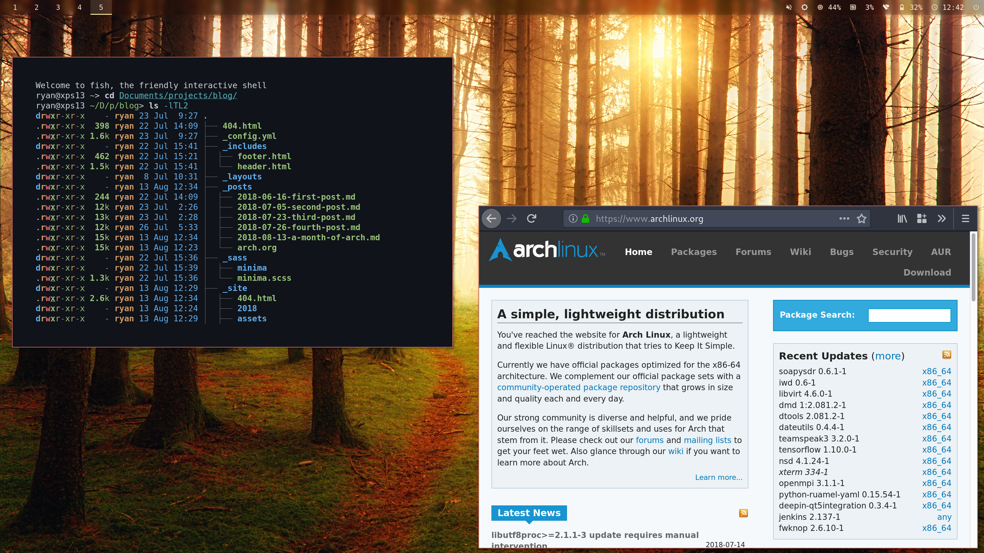
First, I’ll start off by posting a screenshot of what my setup currently looks like. Some of the config was adapted from this Reddit post. The wallpaper is by a guy named Johannes Plenio.

Installing Arch
I decided to partition my 256 GB SSD (well not quite 256 GB) in the following manner:
- 500 MB for EFI
- 75 GB for Windows
- 200 MB for boot
- 31 GB encrypted LVM partition
- 8 GB swap partition (in case I do something very RAM-hungry)
- 25 GB root partition for Arch
- 10 GB Windows recovery partition
- 121 GB shared data partition, encrypted with BitLocker
The EFI and recovery partitions were left over from my Windows install, so I didn’t have to touch those. I first shrank my Windows partition after clean-installing Windows and turning off hibernation, paging, and anything else that would be creating files as I shrunk the partition, creating the data partition under Windows. Then I went through the install process after booting into an Arch USB drive. Interestingly, there are a few more Windows partitions that didn’t show up under Windows. Since they are located adjacently, I assume Windows combines them when viewing partitions.
The install process was a fusion of multiple guides, the one which I followed most being this one.
Filesystems
The EFI partition is FAT and Windows partition is NTFS as required. I chose to make the boot partition as well as the Arch root partition EXT4-formatted, and the shared data partition is read/written using dislocker and NTFS-3G.
Mounting
I use a combination of symbolic links and bind mounts to make my Documents, Pictures, and other large directories stored in the shared data partition. The reason I don’t put my full home directory in there is that the NTFS bitlocker partition can’t store Linux permissions, and some tools like gpg enjoy having specific permissions set on their data directories. Bind mounts are nice because they are all described in my fstab file, but programs like Nautilus confuse some of them for external drives.
AUR downloaders
While it is quite easy to build AUR packages with common tools (such as
cloning the AUR repository with Git, running makepkg -s, then
pacman -U), there exist programs to make this three-step process even
easier. Personally, I’ve really liked
Aura (which is written in Haskell!) as
I can use it to install both official and user packages. There are
plenty of others out there though.
Window managers
With the switch I decided to try out i3 (specifically i3-gaps), after realizing my workflow of having 10 command prompt windows open just didn’t work so well. Using i3, I’ve found myself using workspaces a lot more than I used the equivalent tool in Windows (virtual desktops). Plus it’s really fast to switch between windows when using multiple monitors. So thus far I’ve been very happy switching window paradigms.
Sway: HiDPI is not yet polished (as of writing)
Since Wayland seems to be the way of the future, I decided to try out Sway, which is a version of i3 that uses Wayland rather than X. However, both my terminal and browser (urxvt and Firefox) looked blurry under it. Sway must have been trying to scale them by 2x or something.
GNOME + i3 = simpler setup
While I couldn’t find a method using plain i3 to render applications
correctly on my HiDPI display (xrandr didn’t seem to do anything), I
did find a project, i3-gnome, that
solves my problems. After using its desktop file then launching
gnome-flashback, applications correctly scale. This method has the
side effect of launching many GNOME services, but I find they make the
whole setup process easier as I can use the GNOME settings application
and the background processes to handle things such as WiFi, Bluetooth,
blue light adjustment, color profiles, notifications, etc.
GDM
I also decided to use GDM for login. I needed to do a little extra work to enable tapping to click.
Terminals
Currently I use urxvt, but have not yet found a way to make emoji display correctly (I just get squares). The GNOME terminal displays them correctly though, so I may switch to that. Urxvt also seems to sometimes neglect re-rendering text while scrolling, which is quite strange.
Themes
Arc Dark
Arc Dark is a great dark theme. Normally screenshots of GNOME applications look atrocious, but under Arc Dark everything looks pretty. Not much other explanation is needed.
Arc Icons and Papirus
Initially, I decided to go with the Arc Icon Theme. It’s Arc so it must be great, right? However, I find the Papirus icon theme to have more icons and look nicer and more consistent in my opinion.
Polybar
I’ve been using Polybar to display things such as my i3 windows, time, wifi network, etc.
Fonts (Material Icons + Extended Material)
Since I use a HiDPI display, the siji font Polybar uses (a bitmap font),
displays at half the size it should. That makes it half as easy to read.
To halve the difficulty in reading the icons, I switched to both the
official Material Design Icons (I think I installed that with the AUR
package ttf-material-icons?) and an unofficial, extended
version. The unofficial version
includes all the official icons, but the official ones seem to center
better (emphasis on seem). I got the font for the unofficial set via the
website. The git repository hosting it also has an SVG version of the font,
which embeds both icon names and character codes, that you can pull up
in a text editor. This makes finding an icon by its name fairly easy
because I can use GNOME’s Character Map application to search for the
character code and copy the icon.
My config is below:
font-0 = "DejaVu Sans Mono:pixelsize=18;4.5"
font-1 = Material Design Icons:pixelsize=18;3.5
font-2 = Material Icons:pixelsize=18;5.5
font-3 = Font Awesome 5 Free:pixelsize=14;4
font-4 = Font Awesome 5 Free Solid:pixelsize=14;4
I included the Font Awesome fonts because the Material Design icons do not have a nice set of thermometer icons.
Spotify
There exist many, many scripts to show music player info in polybar. I use a fork I made of this one.
Transparency via Compton
To make polybar transparent, I installed the compositor compton. I could achieve the same effect by giving polybar a background image (not supported but it may be easy to add). But compton also enables nice little flashy animations like windows fading out as they are minimized. So it’s a keeper.
XPS 13 stuff and Arch wiki
The Arch wiki is an amazing resource. A stunning, beautiful, super-useful, ultra-helpful, astoundingly amazing resource. Many programs have pages on the wiki, with example config files and other info their manual pages may leave out. The wiki also happened to have a nice page on my laptop, pointing to wifi driver and bluetooth driver I needed to install to get the Broadcom chip to work, as well as the DisplayLink driver I needed to install to use my HDMI-to-USB dongle.
Rofi and Albert

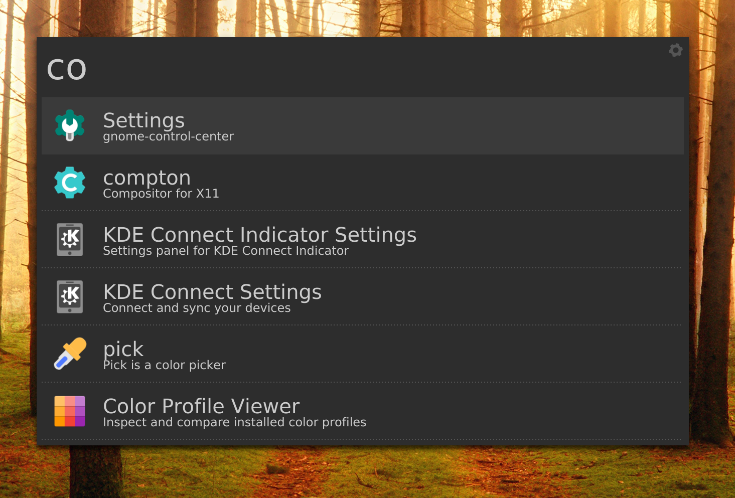
I’ve always been fascinated by Apple’s Spotlight. Microsoft’s Cortana sufficed, but its file search was slow and never seemed to give me what I wanted. Thus, I played around with both Rofi and Albert. Personally I’ve come to prefer Albert as it displays more information per file, and I couldn’t figure out how to disable the shadows Rofi added to icons.
dict + gnome-dictionary

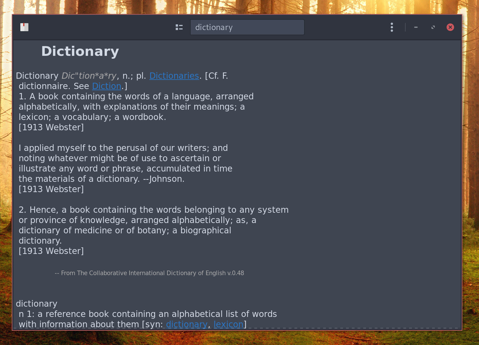
Albert has a nice extension to look up words in a dictionary, so I’ve been using GNOME Dictionary a bit. However, the default setup of the app requires internet access. Interestingly, there exists a nice program (dictd) that allows you to set up your own dictionary server compatible with GNOME Dictionary. There exist a plenitude of tutorials on integrating dictd and GNOME Dictionary online, so I won’t write my own here.
AUR dictionaries
It seems all dictd dictionaries are in the AUR. Below are the ones I’ve installed:
dict-devils: A dictionary limited in scope but unlimited in witdict-foldoc: More computing words and acronyms than you thought were possibledict-gcide: The Collaborative International Dictionary of English. This is what most of the GNOME Dictionary searches yield results from.dict-wikt-en-all: The English Wiktionary. Just like Wikipedia, it has a lot of entries. Like everything.dict-wn: Wordnet, another dictionary full of entries
There are likely more, but these cover most words in the English language.
i3 bindings for screenshots
Initially, I made a key binding that used scrot to take screenshots. It
took me a little while to find out that I needed to use the --release
option with bindsym to make mouse selection (the -s option with
scrot) to work. However, scrot’s rectangle selections never turn out to
be nice rectangle selections and instead end up as modern art
selections. Preferring to avoid artifacts rather than view modern art, I
switched to Slop and Maim, which do not have this problem.
Grabc and xzoom
For color picking, my current workflow is to zoom in on the region I want to grab the color of using xzoom, then use grabc to capture the color from the zoom window. It’s not great, but it’s the best I’ve come up with so far.
Firefox mods
I’ve been using Firefox for a variety of reasons, but one of the main ones being the user interface is very customizable through CSS.
Tab bar hiding
One such modification was that I hid the tab bar. Since it takes up valuable
space, I memorize my small number of tabs (or forget about them), then
use multiple windows and i3’s tabbing system to accommodate more tabs.
This is accomplished with the following line, placed inside the
userChrome.css
file:
#tabbrowser-tabs { visibility: collapse !important; }
Dark theme "support"
With a dark theme, text inputs will sometimes inherit the dark background colors and light text of the GTK theme being used. The Arch Wiki of course documents this problem and gives several solutions. Personally, I launch Firefox with the light Arc theme.
Useful apps
Okular vs. Evince
For viewing PDFs, I’ve tried using the editors from both KDE and GNOME. For annotating, Okular has much greater support (you can draw and edit highlighting colors), while GNOME has much more limitted features in regard to annotating. However, I’m not a big fan of the sidebar and like how many GNOME apps forgo menubars (at least while viewing them in i3).
Kvantum
Being based on KDE platforms (QT to be specific), Okular doesn’t obey GTK themes and does not fit in at all by default. To fix this, I’ve installed the theme manager Kvantum that has an Arc-Dark theme inside of it. This one looks pretty darn close to the GTK theme.
To enable it for all apps, I’ve added the following line to my /etc/environment file along with a few other variables that make Qt scale correctly (credits to the commenters in this GitHub issue for the HiDPI fixes:
QT_STYLE_OVERRIDE=kvantum
QT_SCALE_FACTOR=1
QT_AUTO_SCREEN_SCALE_FACTOR=0
QT_SCREEN_SCALE_FACTORS=2
Festival
Sometimes it’s nice to have text I’m writing read back to me via text-to-speech. Festival is a nice little tool for this purpose, and there’s also an Emacs script that uses festival to read selected text.
Continued over
There’s also a number of programs I used under WSL that I’ve still found super useful. They are listed below.
-
Fish
After using bash for some time, I switched to zsh because of the pretty powerline bars and plugins made available by Oh My Zsh. However, it was much slower than bash under the Windows subsystem. So I found the next best thing, fish, and started using it. Soon, I discovered the slightly different syntax didn’t matter too much to me (I can still write shell scripts in bash), and started relying on the history auto-suggestions. So I’ve continued using that.
-
Weechat
While Weechat is primarily an IRC client, it has plugins that support things such as Matrix, which I use. I also somewhat recently discovered it has a package for Emacs, so I don’t even need to use the command line interface! Although compared to many other command-line chat applications, weechat’s interface is far, far superior.
-
Fzf
In cases that I need to do a fuzzy search over my terminal history, fzf is wonderful. The page also has a nice little script to do a fuzzy search over launched processes then kill the ones you select.
-
Pass
Pass is an extremely minimalistic password manager, but it supports syncing with git! This means I can reuse the git server I have at my home to sync my passwords across my laptop and phone! You have no idea how wonderful this has been.
-
Exa
I’ve aliased
lsto Exa, which provides tree listings and more coloring than the built-in tool. The main reason I use it is for the colors though.
Discurses and Hangups and BitlBee
For two of my three most used chat applications, Discord and Hangouts, I initally used the separate client Discurses and Hangups. However, these applications don’t have an interface as feature-filled as weechat. For example, it’s difficult to navigate through Discurse’s channel list. Eventually, I found an application called BitlBee which spawns an irc server that can proxy my Discord and Hangouts accounts. The Discord plugin for BitlBee was fairly easy to set up, but the Hangouts one was more involved. There are nice instructions here. The only problem is that because I run BitlBee on my laptop, it won’t always be connected to the internet, and may not fetch every message that comes my way. I’ve had to resort to my phone or web applications to look up history, and BitlBee to send messages.
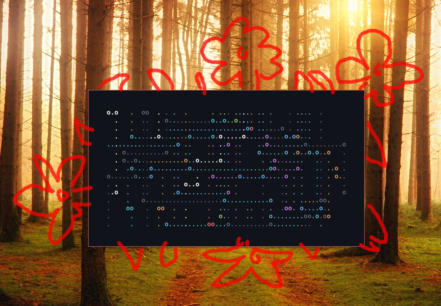
Drawing — still no solution

One of the features I most miss from Windows is the Ink Workspace. Unfortunately, I have not found a suitable equivalent for Linux. Krita seems to come the closest, but it uses the touchscreen only for moving the canvas around. A mouse or pen or tablet are needed to do the drawing. GIMP supports touchscreen drawing, but it’s a bit more than a simple drawing application. The best option I’ve found so far is Gromit-MPX, which allows you to draw over your screen, but it’s still far from the Window’s ink workspace.
Touchegg: gestures
There’s a program called Touchegg that allows custom gestures on touchscreens and mice. I haven’t looked into it much, but it seems promising.
Notifications

While GNOME Flashback does display notifications, I wanted a little more control over their appearance. Thus, I use Dunst. Above is how I configured mine.
Battery life
This was one of my biggest worries with Linux. Thus far, it’s been only somewhat worse than Windows. Apparently, people have gotten 20 hours of battery life with Linux and my laptop, but I have yet to achieve that. Maybe one day…
Conclusion
Thus far, things have been looking good. It’s refreshing being able to use a system I can configure with short commands from the terminal. And I’m really liking the tiling window paradigm. It’ll be interesting to see how far this goes.